
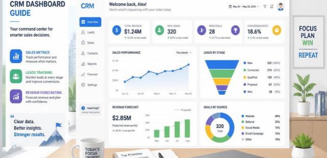
A CRM dashboard gives your team a visual view of customer, sales, and pipeline data in one place. Instead of opening separate reports, you can quickly see performance, stalled opportunities, and changing trends. For U.S. businesses, that faster visibility can make daily sales and marketing decisions easier.
Direct answer: A CRM dashboard is a visual workspace that displays important customer relationship data using metrics, charts, tables, and filters. It can show leads, sales opportunities, conversion rates, forecasts, activities, and revenue. A useful dashboard focuses on information that helps people decide what to do next.
CRM Dashboard at a Glance
| Area | What You Can Track | Why It Matters |
|---|---|---|
| Sales pipeline | Open deals, stages, pipeline value | Shows where future revenue may come from |
| Lead management | New leads, sources, response status | Helps teams monitor customer acquisition |
| Conversions | Lead-to-opportunity and win rates | Shows where prospects move forward or drop |
| Revenue | Won revenue and forecast values | Connects sales activity with business results |
| Team activity | Calls, emails, meetings, tasks | Shows whether required follow-up is happening |
| Marketing | Campaign sources and qualified leads | Links marketing activity with pipeline creation |
| Customer retention | Renewals, churn, account activity | Helps identify existing-customer risks |
| Data quality | Missing fields and stale records | Improves confidence in every other metric |
What Is a CRM Dashboard?
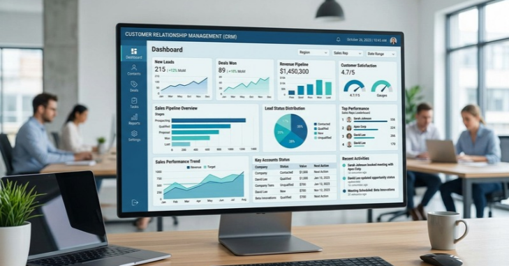
A CRM dashboard (customer relationship management dashboard) turns stored business data into visual information you can scan quickly. It usually combines key performance indicators, charts, tables, filters, and lists. Salesforce describes dashboards as collections of widgets designed to show data from multiple useful angles.
The screen may update as CRM records change, depending on the system and its data connections. Sales managers can monitor pipeline movement without repeatedly exporting spreadsheets. Executives can use broader views to compare performance against revenue goals.
The purpose is not to display every number your software collects. A useful screen highlights metrics that support a decision or action. Extra widgets can make important signals harder to notice.
Why Dashboards Matter to U.S. Businesses
Growing companies often collect information across sales software, advertising platforms, email systems, and spreadsheets. That separation can create inconsistent numbers and slow reporting. A central view helps teams work from a more consistent set of business signals.
Sales leaders can spot deals that have stayed in one stage too long. Marketing teams can compare lead sources with qualified opportunities or closed business. Owners can watch pipeline changes alongside the revenue measures explained by Marketeral.
A visual workspace can also improve accountability when metrics have clear owners. It shows what changed without requiring another status meeting or manual report. The value comes from making a decision faster, not from adding more charts.
9 Metrics Worth Tracking
The right metrics depend on your sales model, customer journey, and reporting goals. A small service company does not need the same view as a national software company. Start with measures that connect activity, customer movement, and revenue.
1. New Leads
Track how many new prospects enter your system during a defined period. Break the total down by source when that information is dependable. This helps show which acquisition channels are producing opportunities.
2. Qualified Leads
Raw lead volume can be misleading when most contacts are poor fits. Tracking qualified prospects gives sales and marketing teams a better measure of potential demand. Teams should agree on qualification criteria before relying on the metric.
3. Pipeline Value
Pipeline value represents the potential value of active opportunities. Viewing it by stage gives you more context than one large total. It can also expose periods where future sales opportunities are becoming thin.
4. Conversion Rate
Conversion rates show how effectively prospects move between stages. You might measure visitor-to-lead, lead-to-opportunity, or opportunity-to-customer conversions. Sudden declines can point to targeting, follow-up, pricing, or sales-process problems.
5. Win Rate
Win rate measures the share of relevant sales opportunities that become customers. Compare it across periods, products, representatives, or customer segments when enough data exists. Avoid judging performance from tiny sample sizes.
6. Sales Cycle Length
Sales cycle length shows how long deals usually take to close. Longer cycles can delay cash and make revenue forecasting harder. Segmenting the metric can reveal which deal types require more time.
7. Revenue Won
Closed revenue connects CRM activity with a result business owners understand. Marketeral’s guide to revenue explains why sales income should still be distinguished from profit. A strong reporting view can keep those financial concepts separate.
8. Sales Activities
Calls, meetings, emails, demos, and follow-up tasks can provide useful leading indicators. Activity counts alone do not prove productivity or quality. Pair them with outcomes such as qualified opportunities or wins.
9. Stale Deals
Older opportunities can quietly inflate pipeline totals. A stale-deal view can flag records without recent activity or stage movement. That allows teams to follow up, update the opportunity, or remove unrealistic pipeline value.
Match the Dashboard to the Person Using It
One screen should not try to serve every role. A salesperson needs immediate tasks and opportunities, while an executive usually needs higher-level trends. Building around the user makes the information easier to act upon.
| User | Useful Information | Main Decision |
|---|---|---|
| Sales representative | Tasks, active deals, next steps | What needs attention today? |
| Sales manager | Pipeline, conversion, rep performance | Where is the team falling behind? |
| Marketing manager | Lead sources, qualified leads, campaigns | Which channels create useful demand? |
| Business owner | Revenue, pipeline, forecasts | Is growth moving in the right direction? |
| Customer success team | Renewals, account activity, churn risk | Which customers need attention? |
Marketing teams should also connect reporting with actual acquisition goals. Marketeral’s guide to attracting more customers and increasing sales covers broader approaches to creating demand. Dashboard metrics can then show whether those efforts produce useful business outcomes.
How to Build a Useful Dashboard
A useful setup begins with decisions rather than charts. Define who will use the screen and what they need to know. Then select the smallest group of measures that answers those questions.
- Choose one audience. Decide whether the primary user is a salesperson, manager, marketer, owner, or another role.
- Define the decisions. Write down three to five questions the person regularly needs answered.
- Choose supporting metrics. Select measures that directly help answer those questions.
- Check your data quality. Fix missing owners, stages, values, dates, and lead sources before relying on visualizations.
- Select clear visuals. Use scorecards for key totals, charts for trends, and tables for record-level details.
- Add practical filters. Time period, region, team member, product, or pipeline filters can make one view more useful.
- Assign metric owners. Someone should understand how each important field gets entered and maintained.
- Review usage regularly. Remove charts that do not support decisions, and add new measures only when necessary.
Keep the first version focused. Shopify notes that modern CRM systems often allow dashboards to be customized for different teams and data sources. Starting small also makes it easier to determine whether people trust and use the information.
Dashboard Examples by Business Goal
A sales pipeline view might display open opportunity value, stage distribution, win rate, and upcoming close dates. This setup helps a manager examine both current opportunities and expected results. Adding stale-deal alerts can prevent inactive records from making the pipeline look healthier than it is.
A marketing view might show new leads, source, qualified leads, conversion rates, and campaign-influenced opportunities. The goal should extend beyond traffic or impressions when sales data is available. Marketeral’s lean content engine guide similarly recommends linking marketing measures to the original business goal.
An executive view usually needs fewer operational details. Revenue, pipeline movement, forecasts, customer growth, and retention may be more useful. Users should still be able to reach supporting records when questions arise.
Common Mistakes That Make Dashboards Less Useful
The first mistake is tracking too much information. A screen packed with graphs forces users to decide which numbers matter every time they open it. That defeats the purpose of having a quick management view.
The second problem is weak underlying data. Missing close dates, incorrect deal values, inconsistent stages, and duplicate records can distort reporting. A polished chart cannot repair inaccurate source information.
Another mistake is tracking metrics without defining the required action. If a number rises or falls, someone should know what question to ask next. Metrics that never influence a decision may not deserve permanent dashboard space.
Finally, avoid using activity totals as automatic proof of performance. Sending more emails does not guarantee more qualified customers. Compare activity with progression, conversions, wins, or other meaningful outcomes.
CRM Dashboard vs. CRM Report
A report usually examines a defined dataset or business question. A dashboard combines several metrics or reports into a single visual workspace. Both formats are useful, but they support different reporting needs.
Use the visual workspace for regular monitoring and quick decisions. Use detailed reports when you need deeper analysis or record-level investigation. Many systems let users move from a chart into the supporting information.
How Often Should You Review Your Dashboard?
Daily reviews can work well for time-sensitive sales tasks and lead follow-up. Weekly reviews are often better for pipeline movement, forecasts, and team performance. Monthly or quarterly reviews can support broader planning and strategic decisions.
The data itself may update more frequently than the formal review schedule. The important part is matching review frequency to the decision. Checking slow-moving metrics every hour adds noise without improving action.
Turn CRM Data Into Better Decisions
The strongest dashboard is not the one with the most charts. It is the one that helps a specific person notice an important change and decide what to do. Clear definitions and dependable data matter more than decorative reporting.
Start with one audience, a few business questions, and the metrics needed to answer them. Review whether each visual changes a decision or prompts useful action. As your sales and marketing process develops, adjust the dashboard rather than allowing it to become a permanent collection of outdated reports.
Frequently Asked Questions
What is a CRM dashboard used for?
A dashboard of this kind is used to monitor important customer, sales, marketing, and pipeline information from one visual screen. It can reduce the need to build routine reports manually. Teams use it to identify changes that require attention or further investigation.
What should a sales dashboard include?
A sales-focused view can include pipeline value, open deals, opportunity stages, conversion rates, win rates, and forecast information. It can also display upcoming activities and deals that have stopped progressing. The final selection should reflect how the company sells.
How many metrics should a dashboard have?
There is no universal number that fits every company. Current CRM guidance commonly favors a focused screen rather than displaying every available measure. Start with the few metrics needed to answer the user’s most important questions.
What is the difference between a dashboard and a report?
A dashboard brings multiple visual indicators together for ongoing monitoring. A report usually provides deeper information about one question or dataset. Teams often use both because the overview can reveal where further analysis is needed.
Can small businesses use CRM reporting views?
Yes, small businesses can benefit from visual CRM reporting when they maintain reliable customer and sales data. The setup does not need dozens of widgets to be useful. A simple view of leads, opportunities, follow-ups, conversions, and sales may provide enough information.